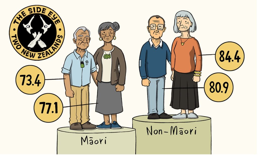
This week here is an cartoon of the difference between Maori life expectancy and the rest of the population. It’s a sobering graph.
Celebrating the People's Republic of Christchurch
This week here is an cartoon of the difference between Maori life expectancy and the rest of the population. It’s a sobering graph.
Kia ora!
I love this graphic. Can I please use it and source you or this website? I am writing a story about Maori life expectancy rates and this graphic explain what I am trying to in words.
Please advise,
Thanks
Renee
https://tuesdayclub.nz/in-conclusion-25-may-2021/#respond
It is not ours, we borrowed it from somewhere else, so can not give permisssion. Apologies